Kiosk - Communicators' Platform
Content centralization | Intuitive UX | Intelligent filtering | Institutional design | Smooth navigation
Introduction
The Kiosk project aimed to design a digital interface to centralize various contents (news, documents, publications) in an easily consultable space. The goal was to create an environment where users can navigate, filter, and find relevant information intuitively and efficiently.

Old version
Observation and objective:
Centralize content : Group together various information (articles, publications, news) in a single space for simplified accessibility.
Improve the user experience : Design a fluid and intuitive interface with filtering options by themes, dates, and other criteria to facilitate research.
Visually optimize for all media : Ensure responsive design for desktop, tablet, and mobile, while maintaining a professional aesthetic.
Project Phases
👤 Creation of personas
Define user profiles to better understand their needs and expectations.
🔍 Analysis of the existing situation
Study similar interfaces and best practices for content centralization.
📑 Definition of objectives and hypotheses
Establish key assumptions to validate the centralization and filtering approach.
🎨 Design and prototyping
Create mockups on Figma, with advanced filters and a hierarchical structure of information.
✅ User testing
Validate the ergonomics and intuitiveness of the interface with a sample of users.
📈 Final adjustments
Optimize design and functionality based on testing feedback to ensure an optimal experience.
Results phase and explanation of final choices
The "Kiosk" interface now offers quick and efficient consultation of centralized content. Thanks to smooth navigation and advanced filters, users can access information in a targeted and organized manner. The visual aspect has been optimized to remain professional and aligned with institutional expectations.
Nouvelle version

Key Metrics
Average search time : reduced by 40% thanks to advanced filters.
User satisfaction rate : 85% of tested users found the interface intuitive.
Mobile access : 60% of users prefer to use the mobile version thanks to the responsive design.
Liste des projets
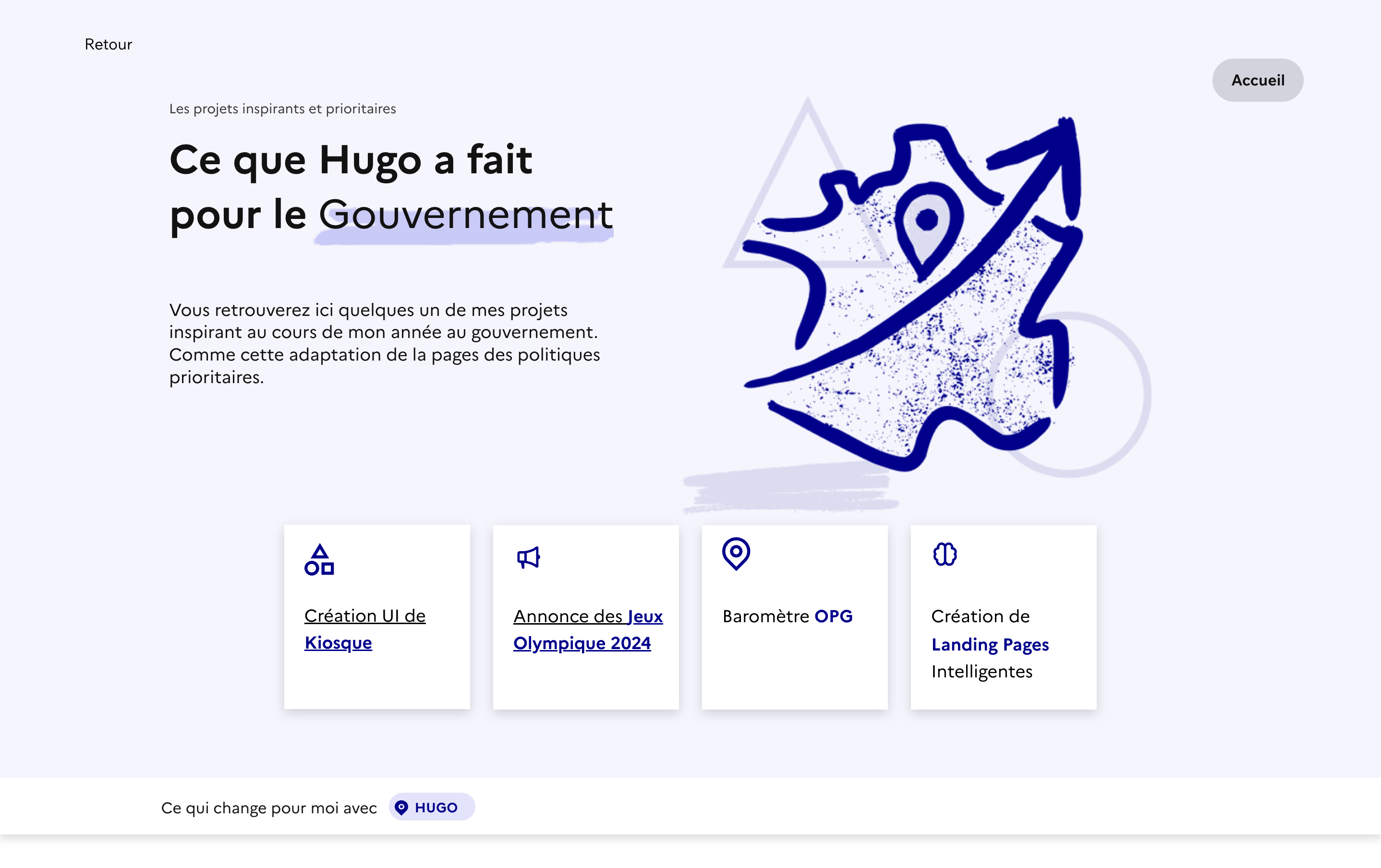
Gouvernement Français
Vous retrouverez ici quelques un de mes projets inspirant au cours de mon année.
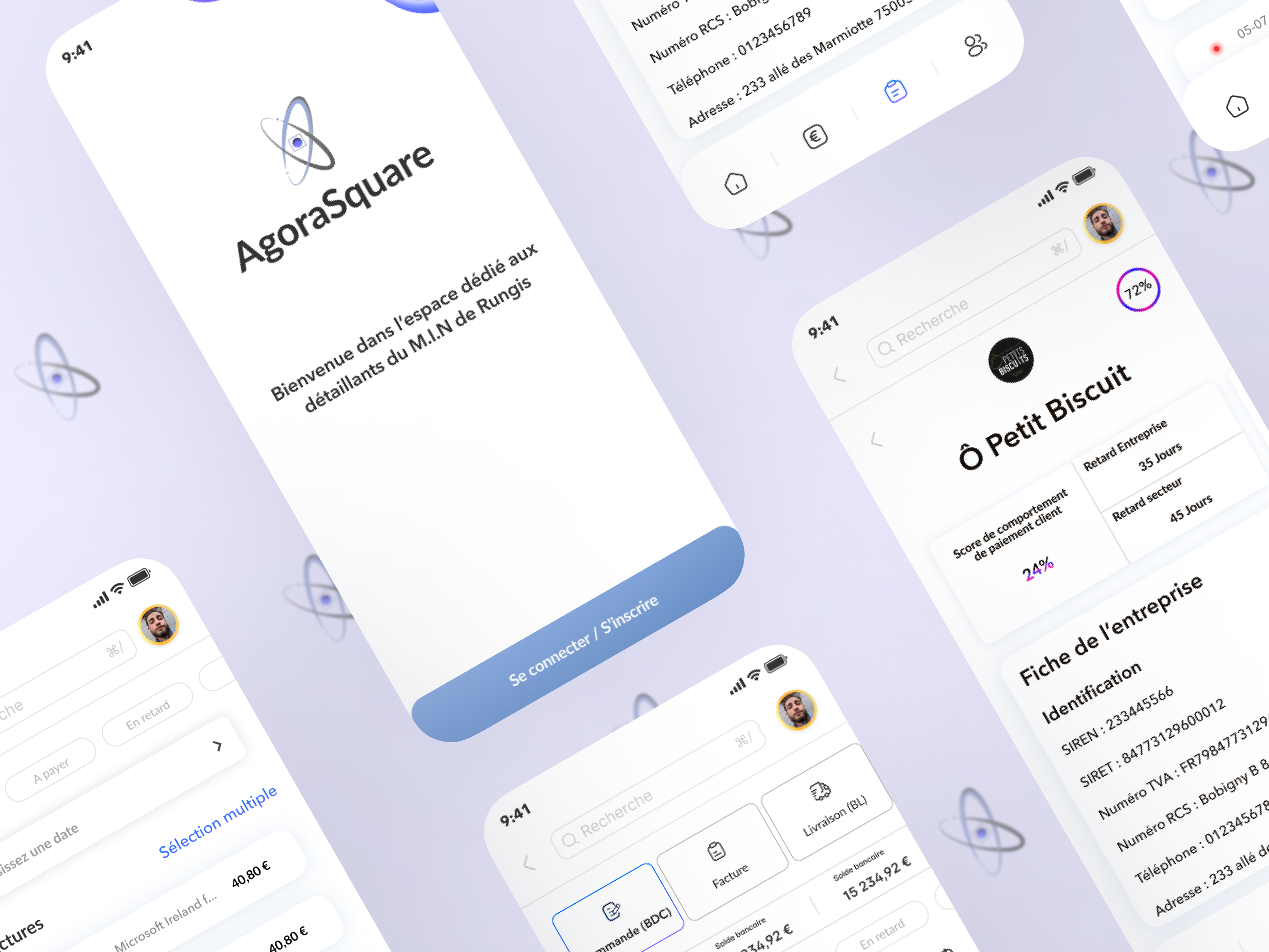
Agorasquare
Application mobile conçue pour optimiser la gestion financière des entreprises.

Master Coach
Master Coach, développé pour une marketplace de coaching.
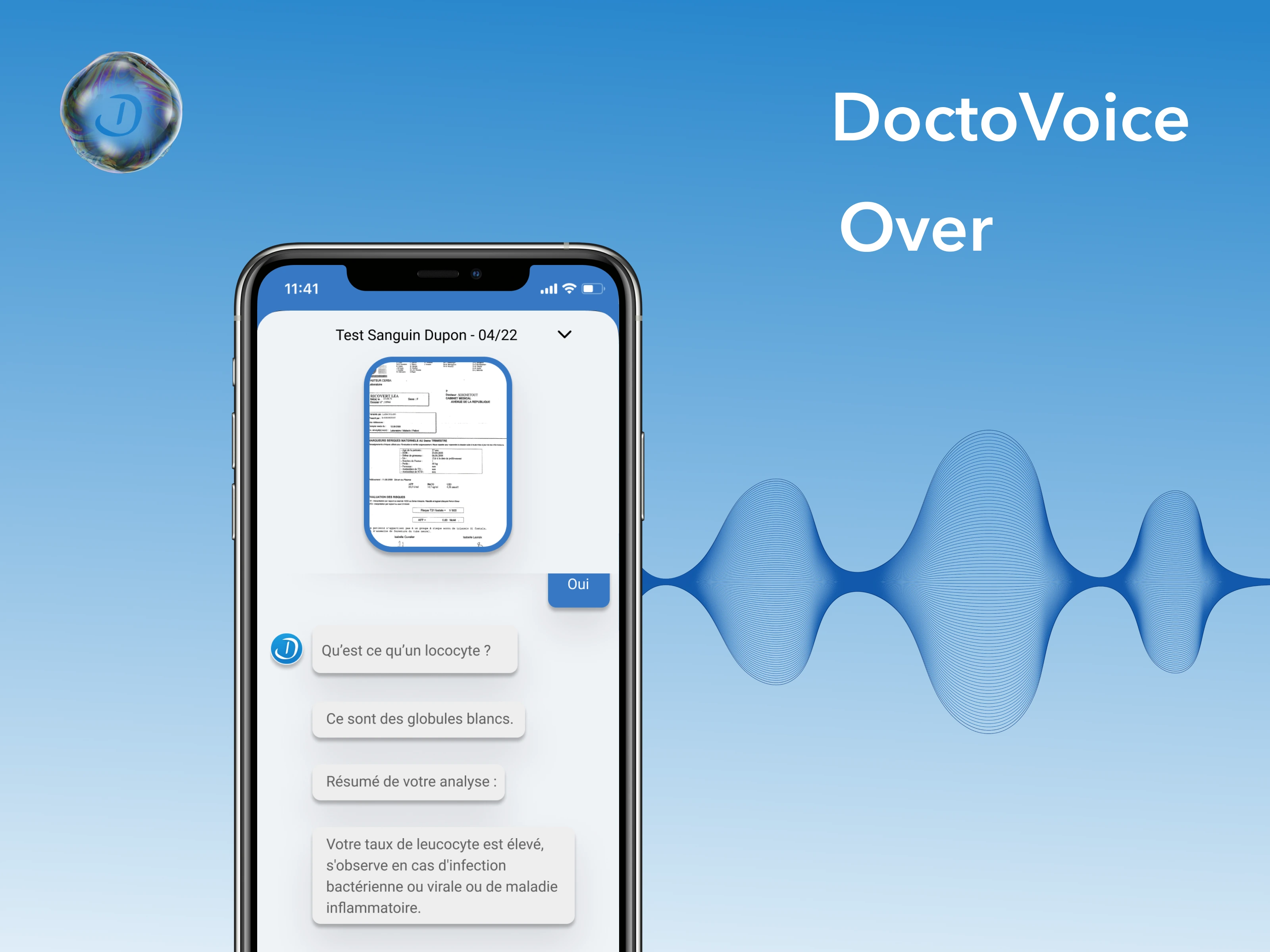
DoctoVoice
Application mobile conçue pour optimiser les interactions médecin-patient.
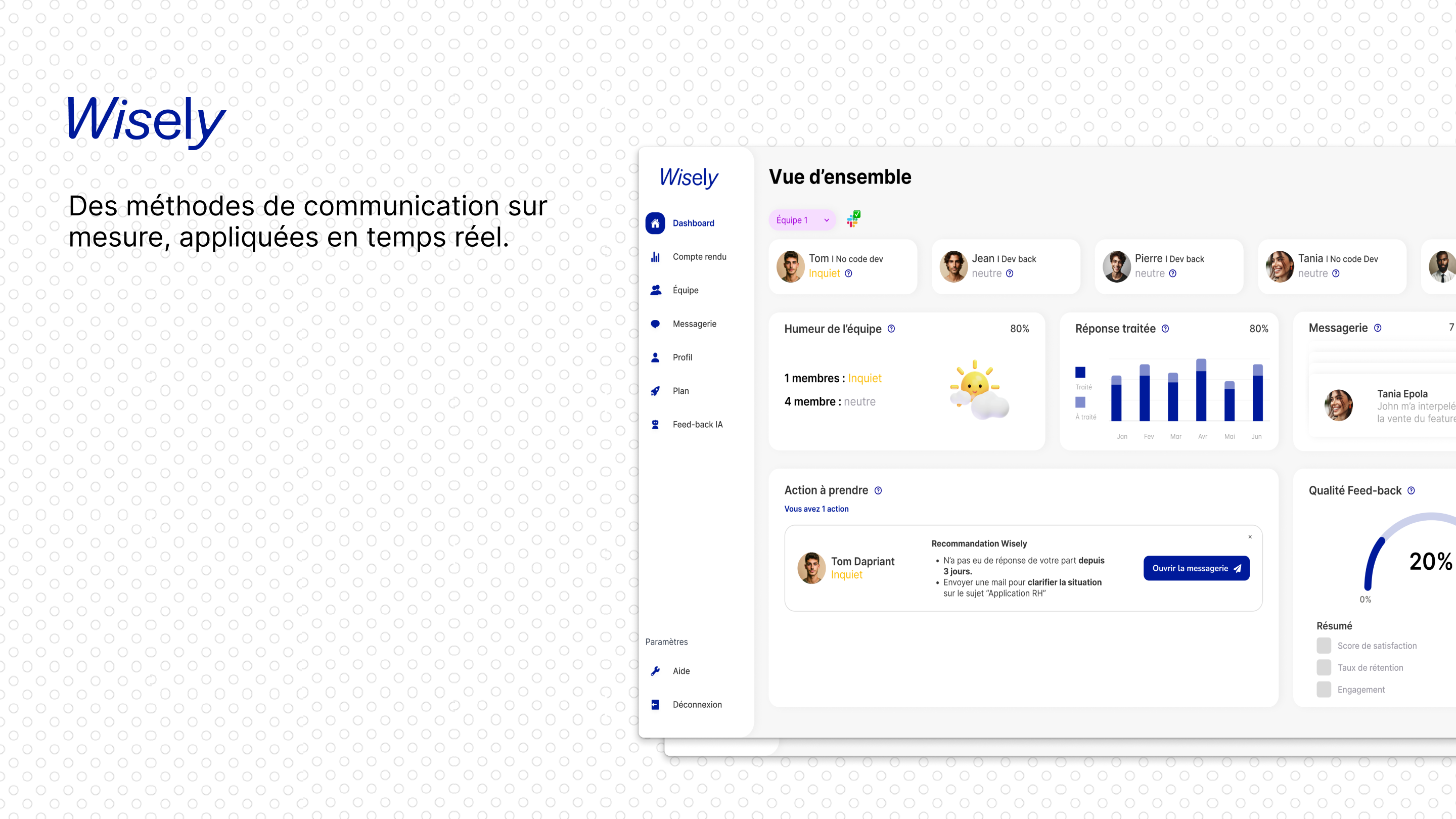
Wisely
Wisely, conçu pour les jeunes managers, est une solution IA qui simplifie la gestion d'équipe.

CoinWave
Coinwave, développé pour Crypto Expert, j'ai conçu une application mobile permettant l'achat...